Blocks
Every block in the library catalog (@gronare/stomme/catalog), with its fields as they are written in a page's frontmatter.
A field path with a dot is a field inside a group: media.kind is written as media: { kind: … }. Defaults are what the CMS fills in when an editor adds the block, and what a block renders when a page written by hand leaves the field out; every switch defaults to off. Each block below is shown live, rendered by the same renderer a page uses, with the YAML that made it underneath. Run pnpm dev and open /lookbook to see every block with sample content, /lookbook/<slug> for one sample on its own page (the slug is the sample's label in the lookbook, such as /lookbook/hero), or /admin/blocks.html for the block gallery stomme cms writes. Add a custom block adds your own.
Fields many blocks share
| Field | Values | What it does |
|---|---|---|
eyebrow, heading, intro |
text | the small label, the heading and the line under it |
style.surface |
standard (default), tint, panel, band, dark, gradient |
the background; the renderer wraps the block in a full-width band, and a block never paints its own |
style.accent |
brand (default), secondary, highlight |
the colour of the block's rule, icon or number; the eyebrow follows eyebrowColor in the theme instead |
layout.beside |
below (default), equal, narrow, wide |
places the block beside the one before it, see Two blocks side by side |
anchor |
text | an id, so #anchor links scroll to the block; every block reads it, though the CMS offers it only on plans, steps and ctaPanel. On a page with a sectionNav, a block with a heading gets the slugged heading as its id instead |
Buttons
A call to action is a cta group: cta.label plus cta.link, where the link is { page: '/about' } for a page on the site or { url: 'https://…' } for anything else, tel: and mailto: included. A second button is cta2, the FAQ aside's button is asideCta, and a featureGrid card carries its own cta.
cta:
  label: Get in touch
  link:
    page: /contact
The older flat pairs still render. block-migrations.json in the package is the full list of renames to the group form:
| Blocks | Flat pair | Group |
|---|---|---|
ctaBox, ctaPanel |
label, href |
cta |
ctaBox |
label2, href2 |
cta2 |
cover, hero, pageHeader |
ctaLabel, ctaHref |
cta |
cover, hero |
cta2Label, cta2Href |
cta2 |
faq |
asideCtaLabel, with asideHref or asideCtaHref |
asideCta |
fragment |
linkLabel, link |
cta |
featureGrid, on each item |
linkLabel, link |
the item's cta |
plans, on each plan |
ctaLabel, ctaHref |
the plan's cta |
Commands, video and headings
- Command.
heroandctaPaneltakecommand, a copyable code line, see Command. - Video.
heroandtextImageplay a looping video whenmedia.kindisvideo, see Video. - Section links. On a page with a
sectionNavblock, every block with a heading gets anidslugged from the heading, made unique with-2,-3, so the chips can link to it. A page withoutsectionNavgets no ids. - Emphasis. In these fields, words wrapped in
*asterisks*are emphasised. In a display heading they are underlined in the heading's colour: theheroandpageHeaderH1, thefeatureGrid,ctaBox,statPanelandplansheadings, thecalloutquote and thefragmentstatement. In thepanellayout ofctaBoxthe underlined words also turn the brand colour. In smaller text they are set in italics: theplansdescription, feature text,note.textand footnote, and thedefinitionsenses'text. Other plain-text fields show the asterisks as written, and Markdown fields set the words in italics.
Two blocks side by side
Set layout.beside on the second block to equal, narrow or wide and the renderer puts the two in one row: equal splits it down the middle, narrow makes the second block the smaller half, wide the larger. Below 900px wide the pair stacks in source order. A row never takes a third block, so three beside blocks in a row make one pair and one full-width block.
Bring to the first visit
- Photos of the garden
- A rough budget
The visit
- Length
- About an hour
- Cost
- Free
- type: checklist
  heading: Bring to the first visit
  layout:
    columns: 1
  items:
    - text: Photos of the garden
    - text: A rough budget
- type: factList
  heading: The visit
  layout:
    beside: equal
  items:
    - label: Length
      value: About an hour
    - label: Cost
      value: Free
Icons
featureGrid items, hero highlights and steps items take an icon by name. The names, in the order the CMS picker lists them:
check, star, heart, spark, sparkles, arrow, search, clock, calendar, pin, map, users, chat, bulb, chart, gauge, award, shield, tag, percent, coins, document, gear, refresh, link, globe, wifi, phone, mail, headset, home, roof, key, truck, tree, wrench, hammer, ruler, paint, plug, bolt, sun, panel, battery, leaf, flame, snowflake, thermometer, droplet, wind, spray, drone, camera, compass
An unknown or blank name draws spark. The CMS offers the names as a list in featureGrid and hero, but steps takes items[].icon as free text, so a typo there shows spark.
Hero and headers
hero
Full-width intro with a heading, text and buttons, and an optional image, video, highlights panel or animated motif.
| Field | Values | What it does |
|---|---|---|
eyebrow, heading, intro |
text | heading is the page's H1 |
ticks[] |
text | short checkmark lines under the intro |
cta, cta2 |
button | the button, and a quiet text link beside it; with no cta2, the phone number from the contact settings takes that place as a call link |
command |
text | a copyable command |
media.kind |
none (default), image, video, highlights, motif |
what shows beside the text |
media.image, media.imageAlt |
image, text | the picture, also the video's poster |
media.video, media.videoWebm, media.videoUrl |
file, file, URL | the video; the URL is used instead of a file when set |
media.ratio |
standard 4:3 (default), wide 16:9, square |
the media's shape |
media.highlights[] |
icon, title, body |
the highlights panel |
layout.height |
normal (default), tall |
tall fills the screen |
layout.align |
top, center (default), bottom |
where the text sits in a tall hero |
layout.width |
full (default), narrow |
narrow centres the hero in a reading column |
layout.mediaPosition |
beside (default), below |
below puts the media under the text at full width |
style.surface, style.accent |
see above |
Start a site in one line.
Scaffold a site, open the CMS and build your first page in an afternoon.
pnpm create stomme my-sitetype: hero
eyebrow: stomme
heading: Start a site in one line.
intro: Scaffold a site, open the CMS and build your first page in an afternoon.
command: pnpm create stomme my-site
cta:
label: Read the tutorial
link:
url: "#"
cta2:
label: See the blocks
link:
url: "#"cover
Full-bleed banner with text over a photo, a looping video, a gradient or an animated pattern.
| Field | Values | What it does |
|---|---|---|
eyebrow, heading, intro |
text | heading is the H1 and keeps line breaks |
cta, cta2 |
button | two buttons |
media.kind |
image (default), video, gradient, animated |
the background; gradient and animated follow the brand colour |
media.image, media.imageAlt |
image, text | the photo, also the video's poster |
media.video, media.videoUrl |
file, URL | the video |
media.overlay |
light, medium (default), strong |
how much the background is darkened |
layout.align |
start (default, bottom left), center |
where the text sits |
layout.vAlign |
empty, end, center, start |
moves the text up or down, keeping its side |
layout.height |
tall (default), medium |
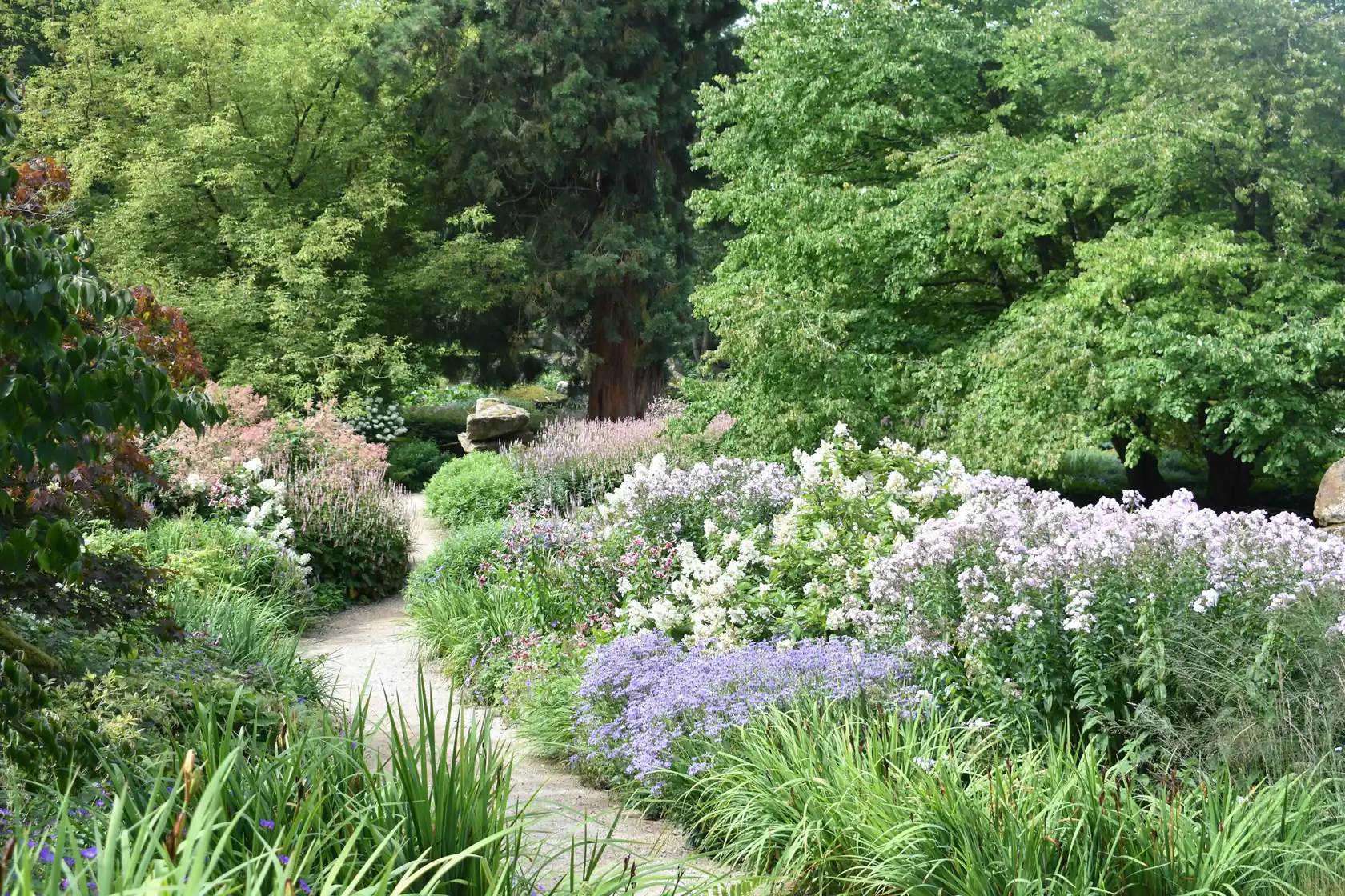
Gardens that get better every year.
We design, build and look after gardens for homes across the valley.
type: cover
eyebrow: Wren & Sorrel
heading: Gardens that get better every year.
intro: We design, build and look after gardens for homes across the valley.
cta:
  label: Book a garden visit
  link:
    url: "#"
media:
  kind: image
  image: ../../starter/public/media/perennial-walk.webp
  imageAlt: A path between beds of lavender and catmint
layout:
  height: medium
pageHeader
Title band for an inner page.
| Field | Values | What it does |
|---|---|---|
eyebrow, heading, intro |
text | heading is the H1 |
cta |
button | |
layout.variant |
light (default), dark |
dark puts the title on a dark full-width band, and when there is a cta, a call link to the contact settings' phone number sits beside it (Call followed by the number, worded by strings.contact.call) |
layout.width |
narrow (default), full |
|
style.surface |
see above |
Garden care
Pruning, planting and a seasonal plan, from one visit a year to one a month.
type: pageHeader
eyebrow: Services
heading: Garden care
intro: Pruning, planting and a seasonal plan, from one visit a year to one a month.
cta:
  label: Ask for a quote
  link:
    url: "#"
Text
prose
Rich text from Markdown. Inline images are optimised and placed by a title keyword, see Images in Markdown.
| Field | Values | What it does |
|---|---|---|
eyebrow, heading |
text | |
body |
Markdown | |
statValue, statLabel |
text | one headline figure under the text |
layout.width |
narrow (default), full |
|
style.surface |
see above |
Plant for the tenth summer
A new garden looks its thinnest on the day it is finished. We plan for the garden it becomes, with shrubs that fill out and perennials that seed themselves where they are happy.
Read more about how a project runs.
9 in 10clients still with us after five years
type: prose
eyebrow: Our approach
heading: Plant for the tenth summer
body: |
  A new garden looks its thinnest on the day it is finished. We plan for the
  garden it becomes, with **shrubs that fill out** and perennials that seed
  themselves where they are happy.

  Read more about [how a project runs](#).
statValue: 9 in 10
statLabel: clients still with us after five years
textImage
Text beside an image or a looping video. With no heading and no text, the media fills the row.
| Field | Values | What it does |
|---|---|---|
eyebrow, heading |
text | |
body |
Markdown | |
media.kind |
image (default), video |
|
media.image, media.imageAlt |
image, text | also the video's poster |
media.fit |
frame (default), cutout |
cutout drops the frame and caps the picture at 20rem, for a picture with a transparent background |
media.video, media.videoWebm, media.videoUrl |
file, file, URL | |
layout.flip |
false (default) |
true puts the media on the left |
style.surface |
see above |
Pruned at the right time
Most shrubs want cutting just after they flower. We keep a calendar for every garden we look after, so nothing is cut too early.
- Fruit trees in late winter
- Lavender after the first flush
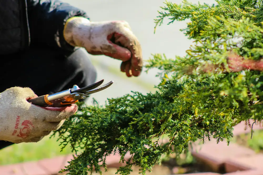
type: textImage
eyebrow: Care
heading: Pruned at the right time
body: |
  Most shrubs want cutting just after they flower. We keep a calendar for
  every garden we look after, so nothing is cut too early.

  - Fruit trees in late winter
  - Lavender after the first flush
media:
  image: ../../starter/public/media/pruning.webp
  imageAlt: Secateurs cutting back a shrub
textQuote
Body text beside a pulled-out quote.
| Field | Values | What it does |
|---|---|---|
body |
Markdown | |
quote, attribution |
text | |
layout.flip |
false (default) |
true puts the quote on the left |
style.surface, style.accent |
see above |
The Hansens wanted somewhere to sit in the evening sun. We moved the patio to the far corner, laid it in reclaimed brick and planted it round with scented things that open at dusk.
We eat outside every night from May.
type: textQuote
body: |
  The Hansens wanted somewhere to sit in the evening sun. We moved the patio
  to the far corner, laid it in reclaimed brick and planted it round with
  scented things that open at dusk.
quote: We eat outside every night from May.
attribution: Eva Hansen, Lower Mill Lane
fragment
An editorial fragment: a large lead line, a short text and an optional link. Fragments in a row drift across the page.
| Field | Values | What it does |
|---|---|---|
eyebrow |
text | usually on the first fragment only |
statement |
text | the large line |
body |
text | |
cta |
button | a link |
layout.placement |
left (default), right, indent |
alternate them to break the grid |
style.surface |
see above |
One wheelbarrow, one van.
Maja and Tom took on their first garden in 2014, a single border behind a cottage.
- type: fragment
  eyebrow: How we started
  statement: One wheelbarrow, one van.
  body: Maja and Tom took on their first garden in 2014, a single border behind a cottage.
- type: fragment
  statement: Twelve years, four hundred gardens.
  body: Most of them still call us every spring.
  cta:
    label: Meet the team
    link:
      url: "#"
  layout:
    placement: right
sectionNav
A row of chips that jump to the headings below it on the same page. The chips are read from the blocks below, so there is nothing to fill in.
| Field | Values | What it does |
|---|---|---|
label |
text | the row's accessible name; default from strings.sectionNav.label |
sections[] |
anchor, label |
a fixed list of chips; when set, the renderer uses it instead of reading the headings below. The CMS does not offer it |
layout.sticky |
false (default) |
true keeps the row at the top of the window while scrolling |
style.surface |
see above |
The chips need blocks below them, so this example renders three.
Opening hours
- Weekdays
- 07.00 to 16.00
- Saturdays
- By appointment
Before your visit
- A few photos of the garden as it is
- A rough idea of the budget
- type: sectionNav
- type: factList
  heading: Opening hours
  items:
    - label: Weekdays
      value: 07.00 to 16.00
    - label: Saturdays
      value: By appointment
- type: checklist
  heading: Before your visit
  layout:
    columns: 1
  items:
    - text: A few photos of the garden as it is
    - text: A rough idea of the budget
Cards and lists
featureGrid
Grid of cards with an icon or a number, a title and text. A card can link.
| Field | Values | What it does |
|---|---|---|
eyebrow, heading, intro |
text | |
items[] |
icon, title, body, tag, cta |
tag is a small label at the card's foot; cta makes the card a link, with Read more when its label is blank |
layout.numbered |
false (default) |
true shows 01, 02, 03 instead of icons |
layout.columns |
3 (default), 2, 4 |
cards per row from 1040px wide; between 700px and 1040px the grid has three columns, below that one |
style.surface, style.accent |
see above |
One team from sketch to tenth summer
Design
A measured plan and a planting list you can keep.
Build
Paths, walls and patios laid by our own crew.
From 4 weeksCare
Seasonal visits that keep the garden on course.
See care plans →type: featureGrid
eyebrow: What we do
heading: One team from sketch to tenth summer
items:
- icon: ruler
title: Design
body: A measured plan and a planting list you can keep.
- icon: hammer
title: Build
body: Paths, walls and patios laid by our own crew.
tag: From 4 weeks
- icon: leaf
title: Care
body: Seasonal visits that keep the garden on course.
cta:
label: See care plans
link:
url: "#"pillars, specialistGrid
pillars is a row of airy columns with a large brand numeral and a top rule, for principles or values. specialistGrid is a denser grid with a brand top rule, for a longer list of capabilities.
| Field | Values | What it does |
|---|---|---|
eyebrow, heading, intro |
text | |
items[] |
title, body |
|
style.surface |
see above |
Three things we hold to
Plant for the place
Soil, light and wind decide the list, not the catalogue.
Build it to last
Proper foundations under every path and wall.
Stay around
The same gardener visits each season.
type: pillars
eyebrow: How we work
heading: Three things we hold to
items:
  - title: Plant for the place
    body: Soil, light and wind decide the list, not the catalogue.
  - title: Build it to last
    body: Proper foundations under every path and wall.
  - title: Stay around
body: The same gardener visits each season.What a care visit can cover
Hedges
Shaped twice a year, by hand where it shows.
Lawns
Scarifying, feeding and overseeding in spring.
Fruit trees
Winter pruning for shape and a better crop.
Ponds
Cleared in autumn before the leaves settle.
type: specialistGrid
eyebrow: Garden care
heading: What a care visit can cover
items:
  - title: Hedges
    body: Shaped twice a year, by hand where it shows.
  - title: Lawns
    body: Scarifying, feeding and overseeding in spring.
  - title: Fruit trees
    body: Winter pruning for shape and a better crop.
  - title: Ponds
    body: Cleared in autumn before the leaves settle.
plans
A row of pricing plan cards.
| Field | Values | What it does |
|---|---|---|
eyebrow, heading, intro |
text | |
plans[] |
name, pricePrefix, price, period, description, features[] (text), badge, highlight, note (label, text), cta |
one card per plan; price is shown as written; highlight: true marks the plan; note is set apart under the features |
footnote |
text | a small note under the cards |
anchor |
text | |
style.surface |
see above |
Pick how often we come
Seasonal
Four visits a year, one each season.
- Pruning and weeding
- A written note after each visit
MonthlyMost chosen
A gardener every month, the same one.
- Everything in Seasonal
- Lawn care from March to October
Prices include green waste removal.
type: plans
eyebrow: Care plans
heading: Pick how often we come
plans:
  - name: Seasonal
    price: £240
    period: per visit
    description: Four visits a year, one each season.
    features:
      - text: Pruning and weeding
      - text: A written note after each visit
  - name: Monthly
    pricePrefix: from
    price: £180
    period: per month
    badge: Most chosen
    highlight: true
    description: A gardener every month, the same one.
    features:
      - text: Everything in Seasonal
      - text: Lawn care from March to October
    cta:
      label: Book a first visit
      link:
        url: "#"
footnote: Prices include green waste removal.
team
Grid of people with a photo and their own contact details.
| Field | Values | What it does |
|---|---|---|
eyebrow, heading, intro |
text | |
items[] |
image, name, role, email, phone, linkUrl, linkLabel, bio |
with no image, a neutral silhouette is drawn; a blank linkLabel shows the address |
style.surface |
see above |
Who you meet
type: team
eyebrow: The people
heading: Who you meet
items:
  - name: Maja Lind
    role: Head gardener
    email: maja@example.com
    bio: Trained at Wisley and has planted every border we have built.
  - name: Tom Reyes
    role: Builds and hard landscaping
    phone: 01632 960 412
    bio: Lays the paths, walls and patios.
steps
A numbered process, as bordered rows or as a connected row of icons.
| Field | Values | What it does |
|---|---|---|
eyebrow, heading, intro |
text | |
items[] |
title, kicker, body, icon, image |
kicker is a short word beside the number, rows only; image is an icon image tinted to the brand colour, used before icon in the flow layouts |
anchor |
text | |
layout.width |
narrow (default), full |
|
layout.variant |
rows (default), flow-soft, flow-filled |
|
style.surface |
see above |
From first visit to first summer
- 01Visit
We walk the garden with you
An hour on site, free of charge.
- 02Plan
You get a drawing and a price
Within two weeks, with a planting list.
- 03Build
Our crew builds it
Most gardens take three to six weeks.
type: steps
eyebrow: A project
heading: From first visit to first summer
items:
  - kicker: Visit
    title: We walk the garden with you
    body: An hour on site, free of charge.
  - kicker: Plan
    title: You get a drawing and a price
    body: Within two weeks, with a planting list.
  - kicker: Build
    title: Our crew builds it
    body: Most gardens take three to six weeks.
checklist
Ticked items in one or two columns.
| Field | Values | What it does |
|---|---|---|
eyebrow, heading, intro |
text | |
items[] |
text, note |
note is a line under the item |
layout.columns |
2 (default), 1 |
any value other than 1 gives two columns |
style.surface |
see above |
Every build comes with
- A measured drawing
- A planting listCommon and Latin names, with where each plant goes.
- One year of aftercare
- Green waste taken away
type: checklist
eyebrow: Included
heading: Every build comes with
items:
  - text: A measured drawing
  - text: A planting list
    note: Common and Latin names, with where each plant goes.
  - text: One year of aftercare
  - text: Green waste taken away
factList
Rows of label and value: specifications, what is included, opening hours.
| Field | Values | What it does |
|---|---|---|
eyebrow, heading, intro |
text | |
items[] |
label, value |
value is plain text and may hold a Markdown link |
layout.columns |
1 (default), 2, 3 |
rows side by side on wide screens |
style.surface, style.accent |
see above |
A typical small garden
- Size
- 80 to 150 m²
- Time to build
- Three to four weeks
- Best time to start
- Late summer, for autumn planting
- Price guide
- See care plans
type: factList
eyebrow: At a glance
heading: A typical small garden
items:
  - label: Size
    value: 80 to 150 m²
  - label: Time to build
    value: Three to four weeks
  - label: Best time to start
    value: Late summer, for autumn planting
  - label: Price guide
    value: See [care plans](#)
Media
gallery
Responsive image grid with captions.
| Field | Values | What it does |
|---|---|---|
eyebrow, heading, intro |
text | |
images[] |
image, alt, caption |
|
layout.columns |
3 (default), 2 |
any value other than 2 gives three columns |
style.surface |
see above |
Finished this year
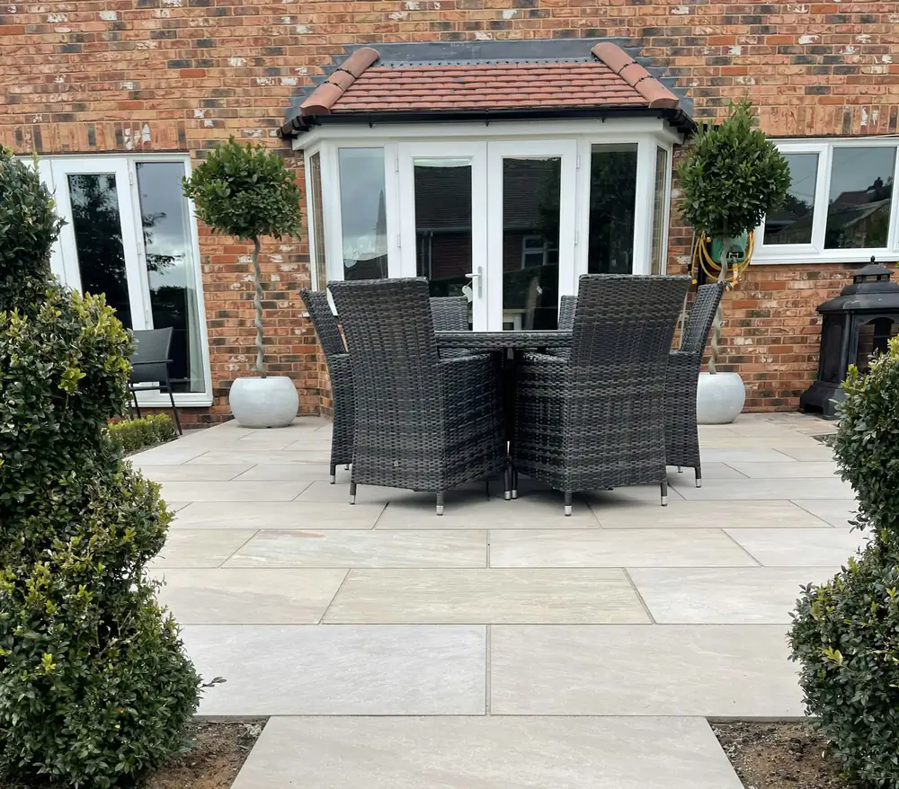
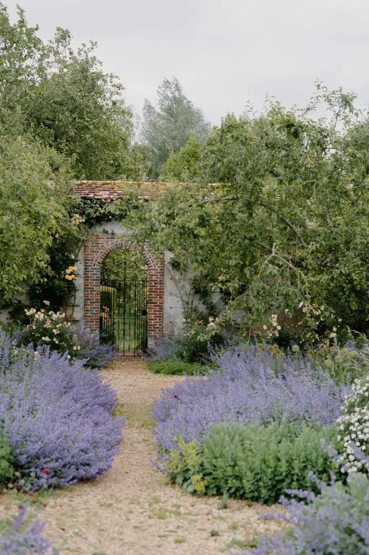
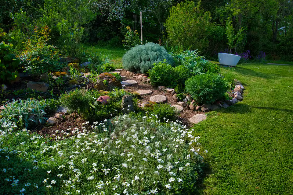
type: gallery
eyebrow: Recent gardens
heading: Finished this year
images:
  - image: ../../starter/public/media/stone-patio.webp
    alt: A stone patio framed by low planting
    caption: A patio in reclaimed stone
  - image: ../../starter/public/media/lavender-arch.webp
    alt: An arch with lavender on both sides
    caption: Lavender along the arch
  - image: ../../starter/public/media/rock-garden.webp
    alt: A rock garden with alpine plants
    caption: An alpine bed on a slope
collage
A collage of fixed height, one leading picture and a few tiles, with a chip that opens every image in a viewer.
| Field | Values | What it does |
|---|---|---|
images[] |
image, alt |
the first five build the collage; all of them open in the viewer |
caption |
text | one line under the collage |
style.surface |
see above |
type: collage
images:
  - image: ../../starter/public/media/cottage-front.webp
    alt: A cottage front garden in full flower
  - image: ../../starter/public/media/brick-path.webp
    alt: A brick path between beds
  - image: ../../starter/public/media/gravel-garden.webp
    alt: A gravel garden with grasses
  - image: ../../starter/public/media/planting.webp
    alt: Young plants set out before planting
caption: A cottage garden on Mill Lane, built over one autumn.
beforeAfter
A draggable before and after slider.
| Field | Values | What it does |
|---|---|---|
eyebrow, heading, intro |
text | |
media.before, media.after |
image | the two photos |
beforeAlt, afterAlt |
text | |
style.surface |
see above |
From bare gravel to planting
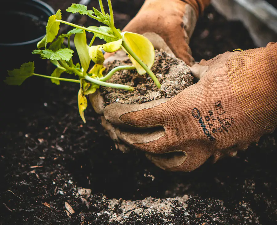
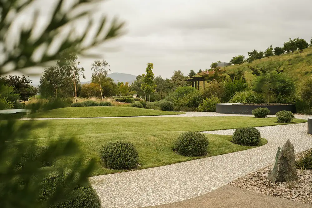
type: beforeAfter
eyebrow: Before and after
heading: From bare gravel to planting
media:
  before: ../../starter/public/media/gravel-garden.webp
  after: ../../starter/public/media/planting.webp
beforeAlt: The bed as bare gravel
afterAlt: The bed newly planted
Video
hero and textImage play a looping video when media.kind is video. It plays muted and inline, and media.image is its poster. Set media.video to an MP4, and media.videoWebm to a WebM as well to have it offered first; media.videoUrl plays a file from elsewhere instead. A visitor who asks for reduced motion sees the poster, and a button on the video pauses and resumes it.
Edit a page and watch it change
The CMS shows the real page beside the form, so a heading you type is a heading you see.
type: textImage
heading: Edit a page and watch it change
body: The CMS shows the real page beside the form, so a heading you type is a heading you see.
media:
  kind: video
  video: ../assets/admin.mp4
  image: ../assets/admin.webp
  imageAlt: Editing the home page in the CMS
Quote and highlight
callout
A single highlighted statement or quote.
| Field | Values | What it does |
|---|---|---|
eyebrow |
text | |
quote |
text | |
layout.width |
narrow (default), xnarrow, full |
|
layout.align |
left (default), center, right |
where the column sits; the text stays left-aligned |
style.surface, style.accent |
see above |
If a plant we put in dies in its first year, we replace it.
type: callout
eyebrow: Our promise
quote: If a plant we put in dies in its *first year*, we replace it.
definition
A dictionary entry: a term, its word class and numbered senses.
| Field | Values | What it does |
|---|---|---|
eyebrow |
text | |
term |
text | use · between syllables |
wordClass |
text | the italic line under the term |
senses[] |
text, note |
note is a muted addendum |
layout.width |
xnarrow (default), narrow, full |
|
layout.align |
left (default), center, right |
|
style.surface |
see above |
per·en·ni·al
adjective · from Latin perennis, lasting the year through
- 1of a plant, living for several years, dying back in winter and returning in spring.
- 2lasting a long time. what we hope for every garden.
type: definition
eyebrow: The word
term: per·en·ni·al
wordClass: adjective · from Latin perennis, lasting the year through
senses:
  - text: of a plant, living for *several years*, dying back in winter and returning in spring.
  - text: lasting a long time.
    note: what we hope for every garden.
statPanel
A dark statement panel beside a giant number, or two or three figures side by side.
| Field | Values | What it does |
|---|---|---|
eyebrow, heading |
text | |
body |
Markdown | rendered as full Markdown, so a blank line starts a new paragraph and links follow the page's language |
badges[] |
text | |
statValue, statLabel |
text | the big number |
stats[] |
label, value, note |
replaces the single number when filled |
style.accent |
see above |
Most gardens fail in the first summer.
New plants need water until their roots reach down. Our first-year visits cover the dry weeks.
new plants lost in a dry first summer.
and we replace those free.
type: statPanel
eyebrow: Aftercare
heading: Most gardens fail in the *first summer*.
body: New plants need water until their roots reach down. Our first-year visits cover the dry weeks.
badges:
  - Watering
  - Replacements
stats:
  - label: Left alone
    value: 1 in 4
    note: new plants lost in a dry first summer.
  - label: With our visits
    value: 1 in 50
    note: and we replace those free.
Numbers
statsBar
A row of label and value figures.
| Field | Values | What it does |
|---|---|---|
items[] |
label, value |
|
style.surface |
see above |
- Gardens built
- 400
- Years in the valley
- 12
- Gardeners
- 6
- Clients who return
- 9 in 10
type: statsBar
items:
  - label: Gardens built
    value: "400"
  - label: Years in the valley
    value: "12"
  - label: Gardeners
    value: "6"
  - label: Clients who return
    value: 9 in 10
timeline
A line of years with a dot per milestone, the last one highlighted.
| Field | Values | What it does |
|---|---|---|
eyebrow, heading, intro |
text | |
items[] |
year, title, detail |
oldest first; year can be wording such as 00s; detail shows on narrow screens |
planned |
text | a dashed note at the end of the line |
style.surface |
see above |
Twelve years in the valley
- 2014The first borderOne garden, one van.
- 2018Our own crewBuilding paths and walls ourselves.
- 2024Six gardenersAnd a nursery bed of our own.
A second team in 2027
type: timeline
eyebrow: Our story
heading: Twelve years in the valley
items:
  - year: "2014"
    title: The first border
    detail: One garden, one van.
  - year: "2018"
    title: Our own crew
    detail: Building paths and walls ourselves.
  - year: "2024"
    title: Six gardeners
    detail: And a nursery bed of our own.
planned: A second team in 2027
logoStrip
A centred row of partner or client names.
| Field | Values | What it does |
|---|---|---|
lead |
text | a lead-in such as Trusted by |
logos[] |
text | the names |
style.surface |
see above |
Gardens for
type: logoStrip
lead: Gardens for
logos:
  - Mill Lane Allotments
  - The Old Rectory
  - Valley Primary School
  - Riverside Hotel
From collections
These blocks read entries from a collection. stomme cms offers a block only while its source is on: the feature flag, or for postList, postArchive and eventList the blog or an article listing, and for catalogList a catalog listing. Content collections lists the entries' fields.
| Type | Reads | Fields besides eyebrow, heading, intro, style.surface |
|---|---|---|
faq |
faq |
entries (pick questions, in order), tag (every question with that tag, ignored when entries is set), asideHeading, asideBody, asideCta (a contact aside, shown when any of the heading, the body or the button label is filled; a button with no link points at mailto: and the contact email, or at the home page when no email is set), layout.variant: list (default), accordion (native <details>), cards, split (an index and a reader) |
testimonials |
testimonials |
none; quote cards |
documentList |
documents |
group (show one group), layout.grouped (false by default; true gives a heading per group). Each row has an icon with the file extension, the title, the note and date, and the file type and size read off the built file |
linkChips |
towns |
none; a chip link to each area's page |
serviceGrid |
services |
services (pick and order a subset; empty shows every service, sorted by its order); cards with an image or a placeholder, linking to each service's page |
subpages |
pages |
pages (pick pages, in order; empty shows the pages under this one; only published pages are listed), layout.variant: cards (default), tiles, rows, chips (labelled strings.subpages.inSection), siblings (for a subpage: the parent's title, strings.subpages.moreInSection, the pages beside this one and a link up); layout.columns 2 (default), 3, 4 for cards and tiles; media.showImages (false by default; true shows each cover, cards only). A card's text is the page's summary, or its seo.description when the summary is blank. Nothing to show renders nothing |
postList |
the blog or an article listing |
text: excerpt (default) or full; media.showImages (false; true shows the covers), media.style: top (default) or corner; layout.featured (false; true makes the newest post a lead card tagged strings.latest), layout.columns (3), layout.limit (newest first), layout.archive (a path linked under the list whenever it is set; when the limit cuts the list, a line strings.post.showingLatest sits above the link). A card shows a picture only when the post sets showCover. A post's category shows as a chip beside the publish date |
postArchive |
the blog or an article listing |
none; every post, grouped by year, newest first |
eventList |
the blog or an article listing, entries with an eventDate |
layout.limit (6, upcoming events only), layout.showPast (false; true dims past events instead of hiding them), emptyText (shown when nothing is upcoming), feedLabel (the text of a link to <route>/calendar.ics; empty hides it). The page ships every dated entry and the browser hides what has passed, so a static page stays current |
catalogList |
a catalog listing |
status: empty (every entry), available, reserved or sold; media.showImages (false; true shows the covers); layout.filters (false; true puts category chips above the grid); layout.columns (3). Cards show the cover, a status badge, the price and the listing's specs. source is the listing it reads: the CMS offers the site's catalog listings and picks the only one when there is one. Without source it renders nothing |
postList, postArchive, eventList and catalogList carry two more fields: source, the id of the listing to read, and base, the route its entries live under. The CMS offers source as a pick of the site's listings: catalogList always, the other three when the site has two or more article listings (the blog counts as one). base stays hidden. Left out, base is the route of the listing source names, so a page written by hand needs only source. postList, postArchive and eventList read the blog (posts under routes.blog) when source is left out. catalogList needs source; when it names no listing, base is /<source>.
They render the site's own entries, so this reference shows their YAML only.
- type: catalogList
  heading: For sale
  source: boats
  base: /boats
- type: faq
  heading: Common questions
  tag: care
  layout:
    variant: accordion
- type: serviceGrid
  eyebrow: Services
  heading: What we do
- type: postList
  heading: From the journal
  layout:
    limit: 3
    archive: /journal
Calls to action
ctaPanel
A full-width call-to-action band.
| Field | Values | What it does |
|---|---|---|
eyebrow, heading, intro |
text | |
command |
text | a copyable command |
cta, cta2 |
button | the second is a quieter outlined button |
anchor |
text |
Make a site of your own
The scaffolder asks for a blank site or the demo garden studio.
pnpm create stomme my-sitetype: ctaPanel
eyebrow: Try it
heading: Make a site of your own
intro: The scaffolder asks for a blank site or the demo garden studio.
command: pnpm create stomme my-site
cta:
label: Start the tutorial
link:
url: "#"
cta2:
label: Browse the source
link:
url: https://github.com/gronare/stommeCommand (a copyable code line)
hero and ctaPanel take command, one line of shell in the code font with a copy button. It scrolls sideways in its own box, so a long command never widens the page, and where the clipboard is unavailable the button selects the text.
Install it and start
pnpm create stomme my-site --demo && cd my-site && pnpm install && pnpm devtype: ctaPanel
heading: Install it and start
command: pnpm create stomme my-site --demo && cd my-site && pnpm install && pnpm devctaBox
A boxed call to action in three layouts.
| Field | Values | What it does |
|---|---|---|
eyebrow, heading, intro |
text | |
cta, cta2 |
button | the second shows as a quiet text link |
facts[] |
label, value |
chips in split, a readout in panel, ignored in classic |
layout.variant |
classic (default), split, panel |
|
style.surface |
see above |
Book a garden visit
An hour on site with a gardener, and a written note afterwards.
type: ctaBox
eyebrow: Next step
heading: Book a garden visit
intro: An hour on site with a gardener, and a written note afterwards.
cta:
  label: Book a visit
  link:
    url: "#"
cta2:
  label: or call 01632 960 412
  link:
    url: tel:+441632960412
facts:
  - label: Visit
    value: Free
  - label: Reply
    value: Within two days
layout:
  variant: split
contactForm
A contact form beside a direct-contact card. It posts to the contact handler and opens routes.formSuccess, see Connect the contact form.
| Field | Values | What it does |
|---|---|---|
eyebrow, heading, intro |
text | a blank heading uses the page title; the heading is the page's H1 when the page has no hero, cover or pageHeader |
labelName, labelEmail, labelMessage, submitLabel |
text | blank uses strings.contact |
showPhone |
false (default) |
true adds a phone field |
requirePhone |
false (default) |
|
showCategory, categories[], labelCategory |
false, text |
a dropdown; needs at least one category |
showUnit, labelUnit, placeholderUnit |
false, text |
a short free-text field |
showDirectContact |
false (default) |
true puts the direct-contact card beside the form; without it the form fills the width |
inbox |
text | sent with the message as inbox, for a handler that routes by it |
style.surface |
see above |
type: contactForm
eyebrow: Contact
heading: Tell us about your garden
intro: A few lines is plenty. We reply within two working days.
showCategory: true
labelCategory: What is it about?
categories:
  - A new garden
  - Garden care
  - Something else
showDirectContact: false
contactSwitch
Two or more contact forms on one surface, shown one at a time, switched without a page load.
| Field | Values | What it does |
|---|---|---|
eyebrow, heading, intro |
text | the heading is the page's H1 when the page has no hero, cover or pageHeader |
items[] |
label, description, intro, and every contactForm field from labelName to inbox |
one form per errand; the first is open when the page loads; description shows in the cards layout only. An item with no label is dropped, and a single item shows its form with no switch |
layout.variant |
segmented (default), cards, tabs |
how the visitor switches |
style.surface |
see above |
type: contactSwitch
heading: How can we help?
items:
  - label: A new garden
    intro: Tell us roughly what you have in mind and where.
    inbox: design
    showDirectContact: false
  - label: Garden care
    intro: Say how big the garden is and how often you would like us.
    inbox: care
    showPhone: false
    showDirectContact: false
contactCard
The direct-contact card on its own, filled from the contact settings.
| Field | Values | What it does |
|---|---|---|
show |
any of phone, email, hours, address, map, socials; default none, so the card shows only its label |
a part with no data is skipped; map needs lat and lng on the address and a map provider, maps.provider: 'osm' or a Google maps.key, in the site config |
label |
text | blank uses strings.contact.direct |
tint |
false (default) |
true gives a tinted background |
style.surface |
see above |
It reads the site's contact settings, so this reference shows its YAML only.
type: contactCard
show:
  - phone
  - email
  - hours
findUs
A map beside the address, contact details and hours, filled from the contact settings. The map shows when the address has lat and lng and the site config sets maps.provider: 'osm', or a Google maps.key. It loads from the provider only when the visitor clicks.
| Field | Values | What it does |
|---|---|---|
heading |
text | blank uses strings.contact.findUs |
showHours |
false (default) |
true lists the opening hours |
style.surface |
see above |
It reads the site's contact settings, so this reference shows its YAML only.
type: findUs
heading: Visit the yard
map
A map picture with the address and two buttons that hand the route to Google Maps or Apple Maps. No third-party script runs on the page until the visitor asks for one: with coords and a map provider (maps.provider: 'osm', or a Google maps.key), the map offers a button that loads an interactive map, as findUs does.
| Field | Values | What it does |
|---|---|---|
address |
text | shown in bold, and used for the route when there are no coordinates |
note |
text | a quiet line beside the address |
media.image, media.imageAlt |
image, text | a static map you exported; with coords and a Google map key, a site built with an adapter shows Google's still instead, served through the site's own /map/ route |
media.credit |
text | printed over the picture; a map from OpenStreetMap must credit © OpenStreetMap contributors |
media.pinX, media.pinY |
0 to 100 | where the pin sits, in percent; leave both blank for no pin |
coords.lat, coords.lng |
numbers | land the map app on the door instead of the street |
style.surface |
see above |
Mill Lane 4, Lower ValleyThe yard gate is on the left, past the barn.
type: map
address: Mill Lane 4, Lower Valley
note: The yard gate is on the left, past the barn.
Choosing between similar blocks
| Block | What sets it apart |
|---|---|
pillars |
airy columns with a large brand numeral and a top rule, unlike featureGrid (boxed, small numeral) or specialistGrid (top rule, denser) |
specialistGrid |
denser than pillars, with no large numeral, and flatter than featureGrid, with no box or icon: a longer list of capabilities under one service |
team |
named people with a photo and their own phone, email and profile link; specialistGrid lists roles with no photo and nobody to contact |
ctaBox |
three layouts, with facts feeding the split card's chips and the panel's readout; ctaPanel is the full-width band |
prose |
its pull-stat is for the one headline figure a text section earns; statsBar is the row for several |
factList |
one row per fact, label beside value; statsBar is a row of big numbers, definition a single word being defined |
contactSwitch |
one surface, one form at a time; two contactForm blocks one under the other ask the visitor to read both |
map |
a picture and two route buttons for any address you type, with nothing loaded from a map provider until the visitor clicks; findUs reads the address, contact details and hours from the contact settings |
Images in Markdown
Markdown fields, such as the bodies of prose, textImage and textQuote and of blog posts, go through renderMarkdown from @gronare/stomme/markdown. Each inline image becomes a figure, and a title keyword lays it out: left, right, wide or center, plus small or large. With no placement keyword the image is centred in a column up to 30rem wide. The alt text is also printed under the image as a visible caption. Only images under /media/ that are uploads in src/assets/media/ are optimised; any other path is used as written.
The CMS's Image button writes that Markdown for editors.
A link in a Markdown field to a page on the site gets a trailing slash, [the team](/about) becomes /about/, and in the prose, textImage, textQuote and statPanel bodies on a site with more than one language it points at the page in the language being read. Links to files, bare #anchor links and links to other sites are left as written.